


OVERVIEW
Role
- Sole UX researcher & UX/UI desinger
- Design logo and informational website
- Maintain brands identity while creating a new and professional feel for the website
- Usable from all devices
- Met with client and mentor weekly
- Duration 6 weeks
WHAT IS OLYMPUS?
Olympus is an Atlanta based metal recycling company. They operate a small metal yard as well as offer commercial and industrial recycling solutions. Olympus prides themselves in expertise in the recycling industry, their status as a green company, and their reputation as a professional brand that customers can trust.
PROBLEM
Olympus has never set up their web presence in a meaningful way. The current website is a wordpress site with many issues, including broken pages. Olympus has recently begun to spend on advertising and has a high page bounce rate that they need to improve to make their investment worthwhile.
SOLUTION
A complete overhaul of the website that focuses on the company's goals. A strong call to action and a clean and clear presentation of the often complex information related to metal recycling.
PROCESS
RESEARCH
The goal of the research phase was to discover the trends and patterns across various metal recycling companies, especially direct competitors of Olympus in Atlanta. To discover the various ways that the complicated information around metal recycling were presented. And to fully understand the needs of the customers in the space.
Competitive analysis
The first step of the research process was to understand the players in the space. A careful approach was used to look at both the local competition as well as the large players in the space.
An Interesting challenge emerged -- even the larger players in the space did not seem to have a clean way to present the complex information. This presented a large opportunity to innovate.

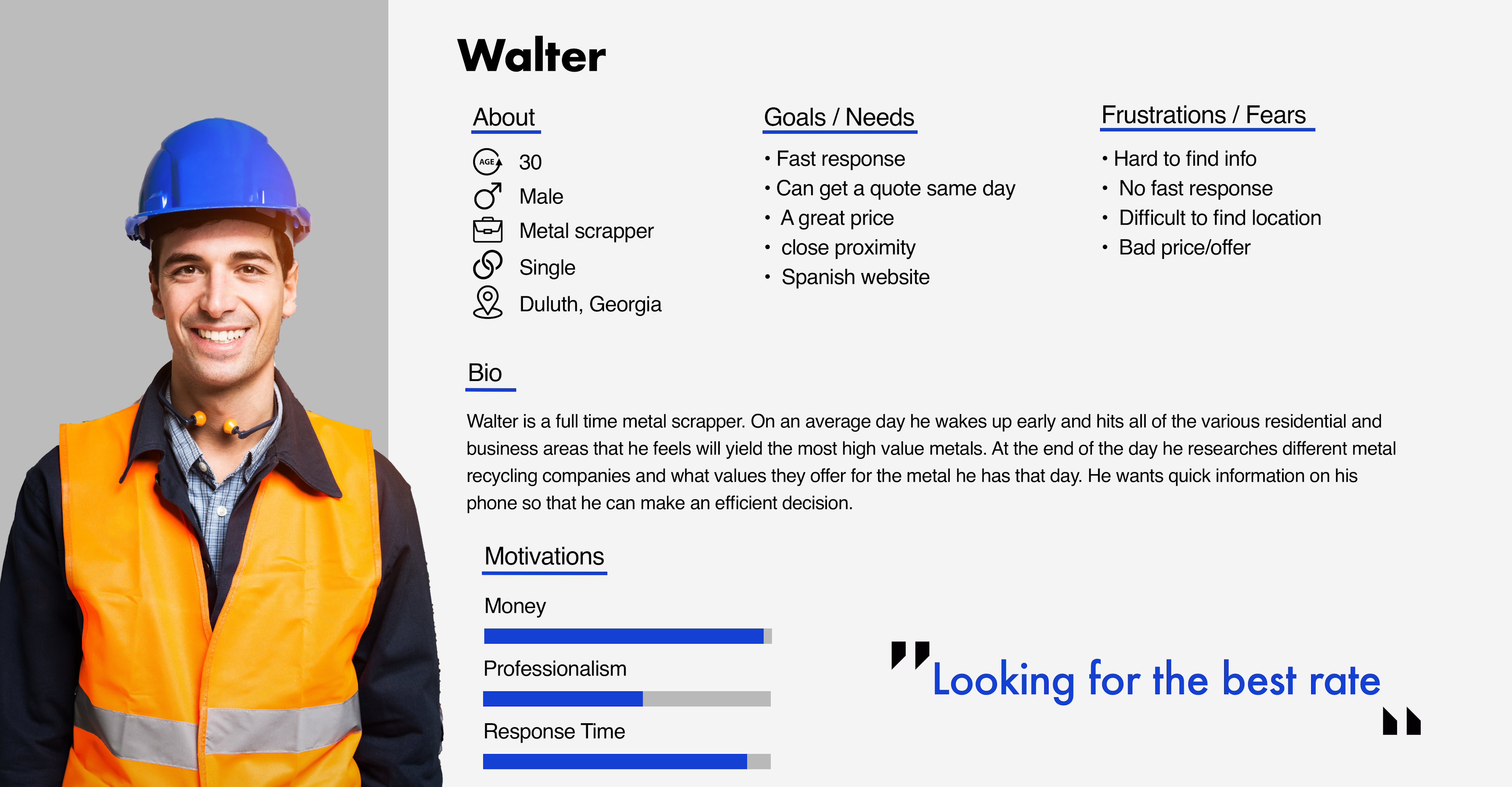
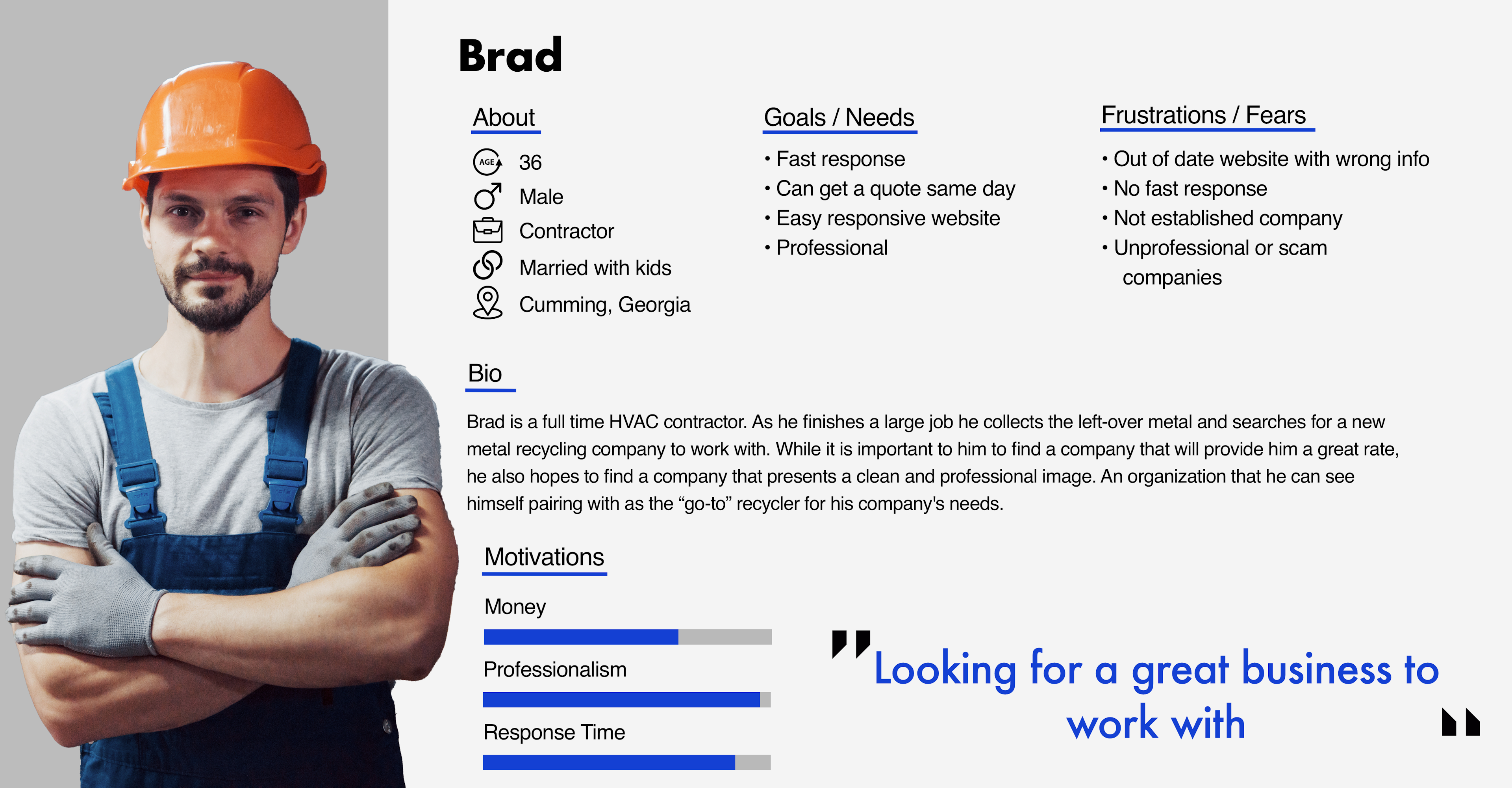
USER PERSONA
In order to determine the best way to arrange the information it was important to get into the minds of potential customers. While Olympus does need to provide information to customers who are just getting into the metal recycling space, many of the users are professional recyclers who need quick information and quotes.
information architecture
In this phase the research was utilized to rework the arrangement of the site. In its original form the site was very unorganized and difficult to navigate. With the complex navigation on the original site it was very easy for users to become overwhelmed and exit the page.
Original Sitemap
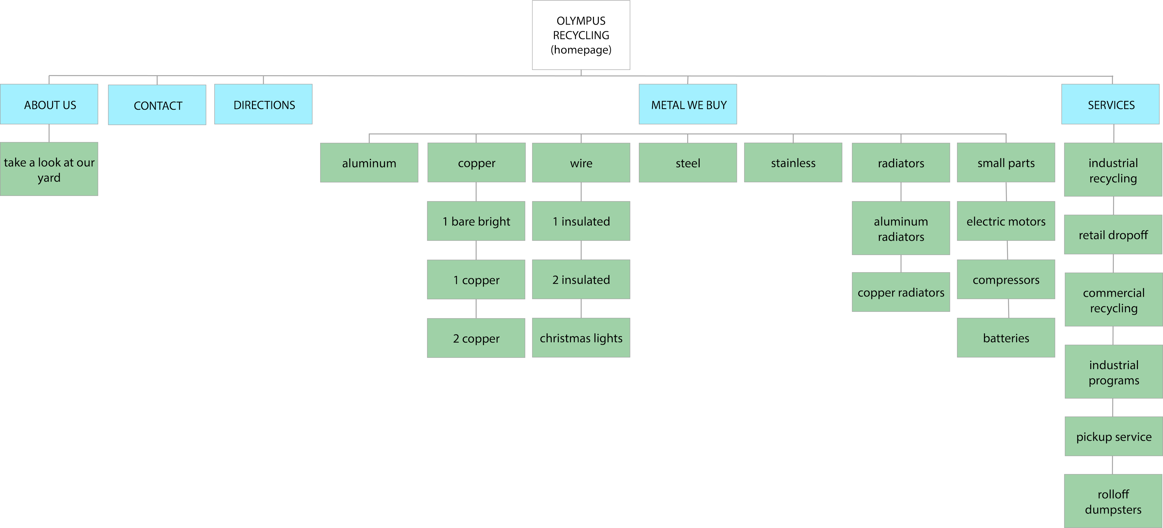
It was important to the client that all of the information from the original site be maintained. This presented one of the largest challenges of the project. Based on the market research I knew it was important that the site was paired down to as few pages as possible, but the sheer volume of confusing information made this task very difficult
Ultimately I used cards to organize the information into smaller categories. This allowed me to pair the site down in a major way.
New Sitemap
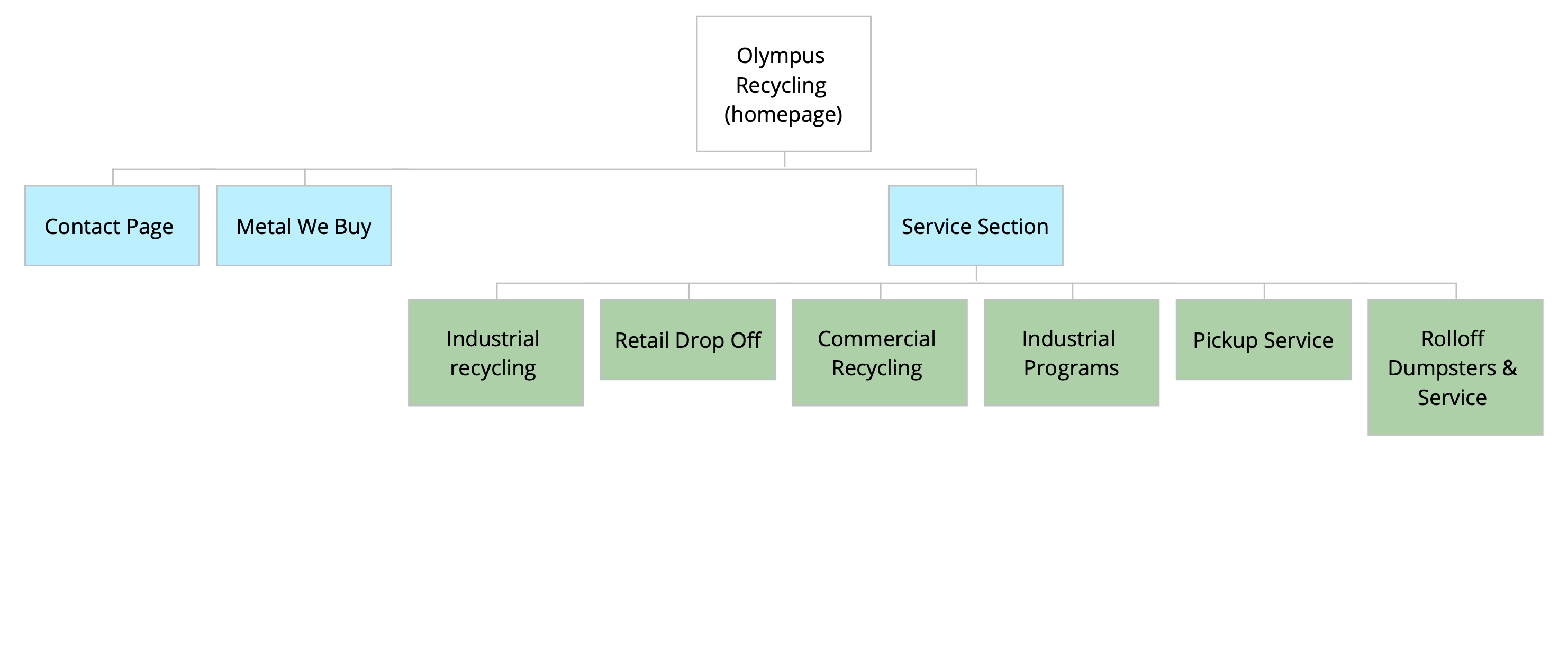
This new architecture removes the deep navigation to keep everything on only a few pages, allowing the user to intuitively know where they are on the site at all times.
interaction design
Now that the site architecture was more clean, it was important to carefully think through how the information would be presented. While fewer pages prevent “lost” users, there is the tradeoff of much more information on each page.
Wireframes
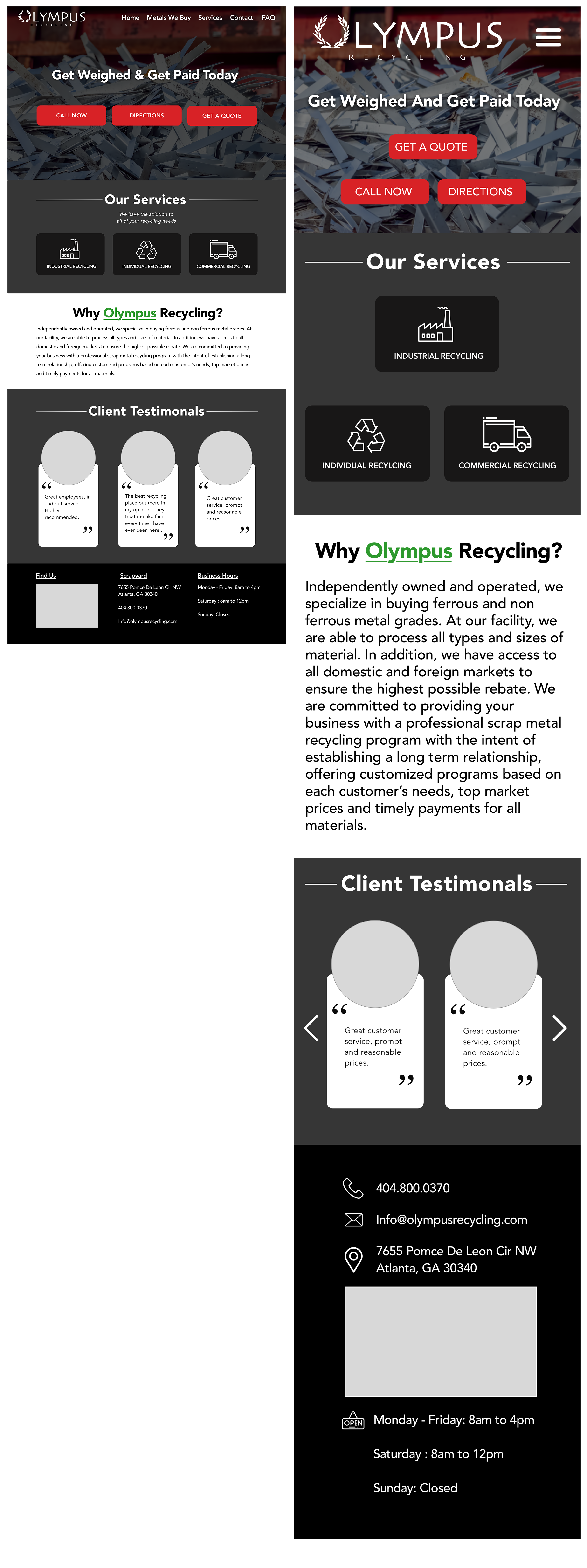
For the homepage the client requested that I keep the three call to action buttons. This works well here to present users in a hurry with quick options. I also made the decision to use repetition of three elements down the page to maintain a visual consistency.

For the pages that present lists of information I added a sub navigation. These sub-navigation bars “sticky” to the top on scroll so that the user always has access to them.
This decision allows for the quick navigation and access to information that the original site had, without the clutter of too many pages that cause confusing site architecture.
Finally, for pages that originally had forms, call to action buttons were used instead. This has the benefit of making the user feel “locked in” to the decision to fill out the form, rather than seeing the form and choosing to exit.
Visual design
The final step was to bring all of this together to create a more cohesive brand for Olympus. The company suffered from very inconsistent branding and colors.
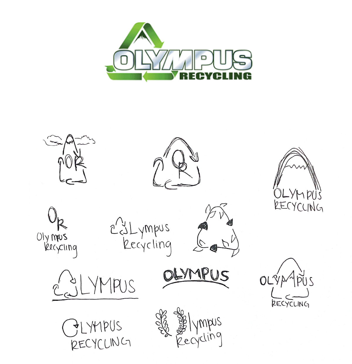
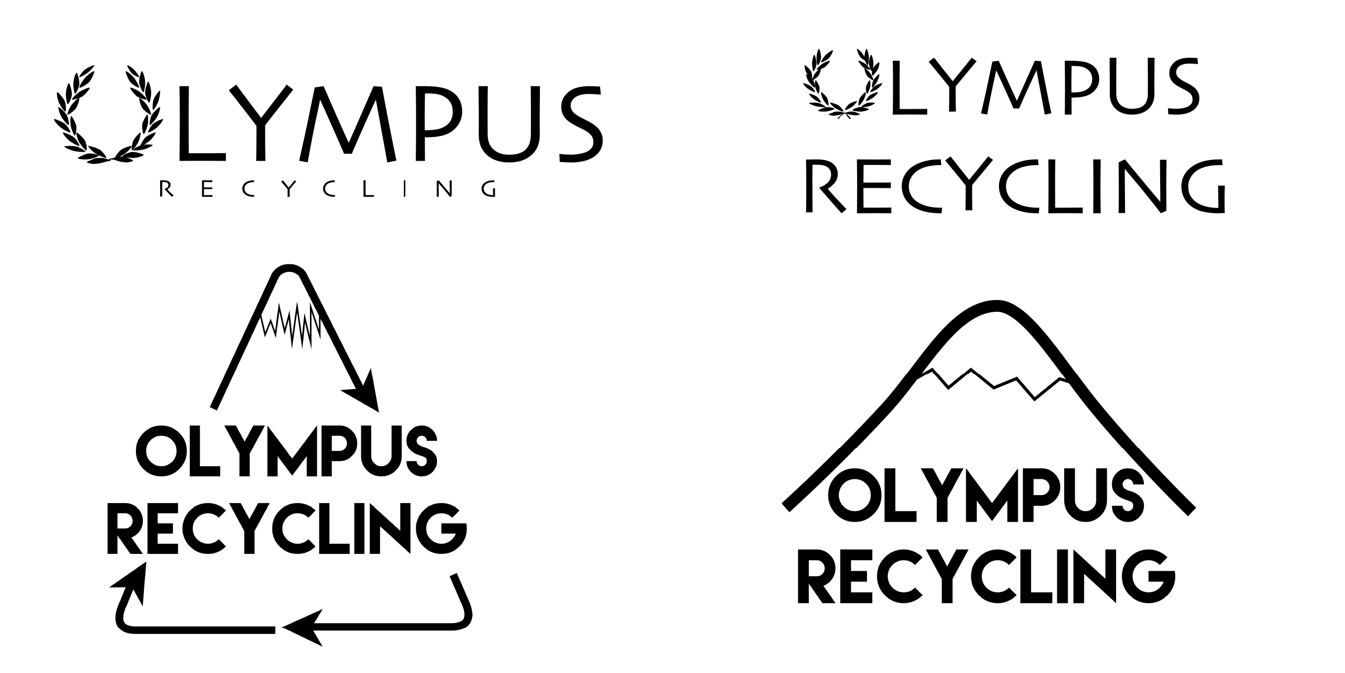
Logo
A redesign of the logo created a more flat and modern look

design
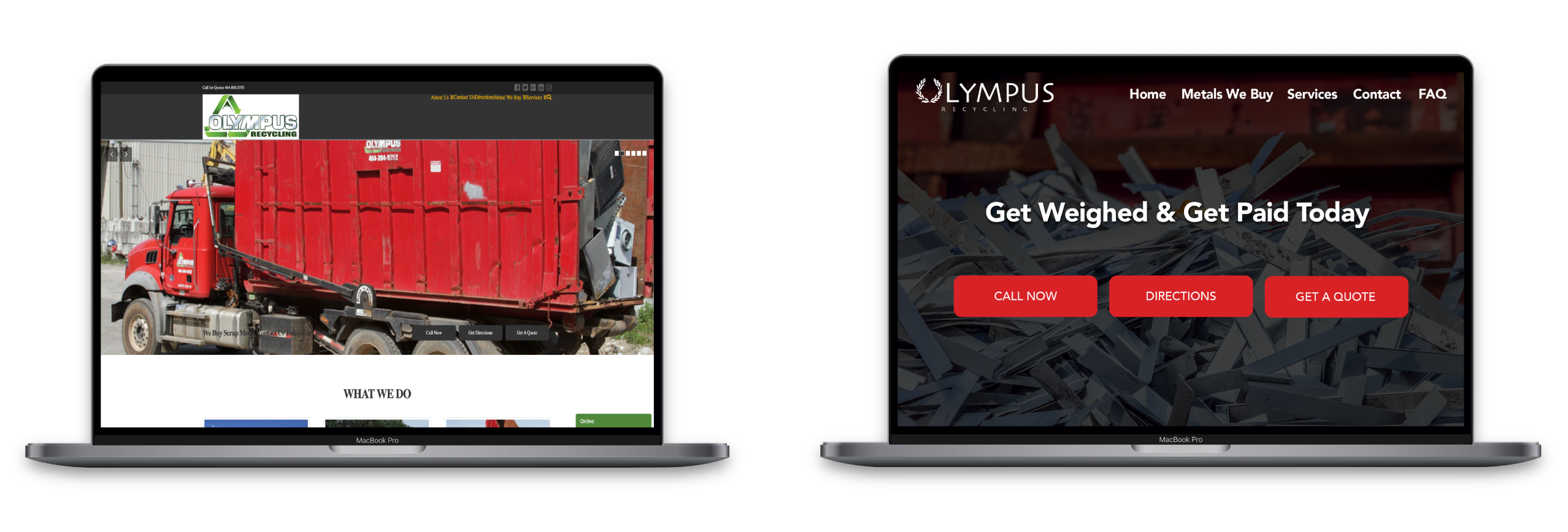
The final design presented a few interesting challenges. The client requested a color scheme of red (to match their trucks) and green (for recycling). This immediately creates the dilemma of bringing those colors together without evoking christmas. Ultimately I was able to use the green sparingly and keep it separated from the red meeting the clients request while maintaining brand integrity.
The client also provided several photos of their trucks and scrap yard to incorporate. It proved difficult to make these images flow with the design and provide visual interest that didn’t feel messy. I instead opted to use close up images of metal for the hero images. These images provide context to the page and visual interest without feeling “dirty”. Recycling may be green but it’s a dirty process
FINAL THOUGHTS
outcome
The client goal, to improve their web presence and increase their branding consistency was achieved. The site was able to maintain a masculine feel, while still being clean and professional. I also managed to implement all of the clients requests in regards to design. The new site presents all of the information of the original site in less than half the number of pages.
next steps
From the research phase of the project I suggested to the client that they should consider implementing a spanish version of their site. The client agreed that this was a great idea and is something that we plan to work on together in the near future.
key takeaways
This project presented many interesting challenges. I knew making recycling look nice would be difficult, but I did not anticipate the extreme complexity in the information architecture phase. By continuing to go back to the personas and really make an effort to get in the heads of the users, I was able to make huge improvements to the website without omitting any information. This project took me out of my design comfort zone which, while challenging, ended up being extremely rewarding.


