


OVERVIEW
ROLE
- Sole UX researcher & UX/UI designer
- Plan flow of the app, conceptualize and implement design
- Create a brand identity that suits the needs of this new app
- Usable from mobile devices
- Met with mentor weekly
- Duration 4 weeks
BACKGROUND
The world of streaming video content continues to grow year over year. Recently, however, this space has experienced a rapid expansion in the number of platforms available to consumers. In previous years, this landscape was dominated by a few major players - Netflix, Hulu, Amazon - in 2020 the market of major players more than doubled with the addition of new big players - Apple, Paramount, Disney, and NBC. Americans are streaming more than ever, in 2020 the average American was streaming nearly 8 hours of content a day.
CHALLENGE
This extreme expansion in the amount of content and the number of platforms to watch it on has made it nearly impossible to easily and quickly decide what to watch. While the platforms themselves have invested heavily in creating recommendation algorithms to keep viewers hooked, there has yet to be a successful implementation of a cross-platform recommendation provider. It often can take nearly an hour for a couple to agree on what to watch for a movie night.
THE PITCH
An app that allows couples to quickly and easily decided on movies/shows they agree on so that they can get straight to watching and skip the decision-making process. The app will work similarly to tinder, a couple will sign up and then individually swipe through movies and shows, the app will then curate the content that they both agreed (swiped right) they would like to watch together.
PROCESS
RESEARCH
The goal of the research phase was to try to best understand consumer tastes and preferences when it comes to deciding what to watch. Because this idea is taking some UI patterns from the dating app world and applying them to movie/tv recommendations, I also chose to do some digging to discover if anything could be improved or iterated upon in that space.
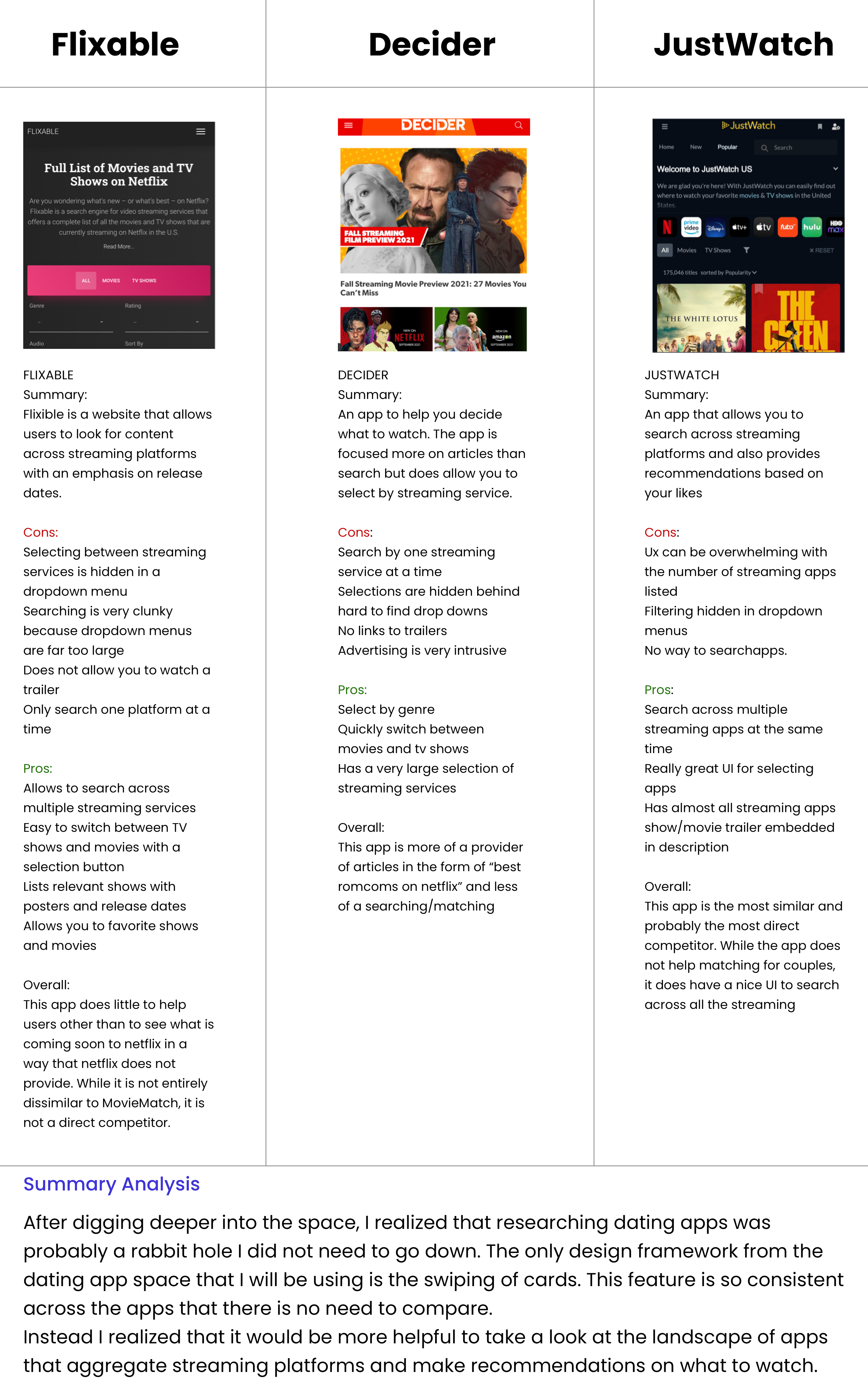
Competitive analysis
My initial feeling was that because the user interface would be similar to a dating app, it would be best to compare and contrast the offerings of major dating apps for a competitive analysis. I quickly realized, however, that the core feature that MovieMatch would be utilizing (swiping left and right) is functionally identical in each of these apps.
I instead opted to explore the players in the cross-platform movie recommendation space to see if their user interfaces and feature sets could provide me with context that could improve the final design of MovieMatch.
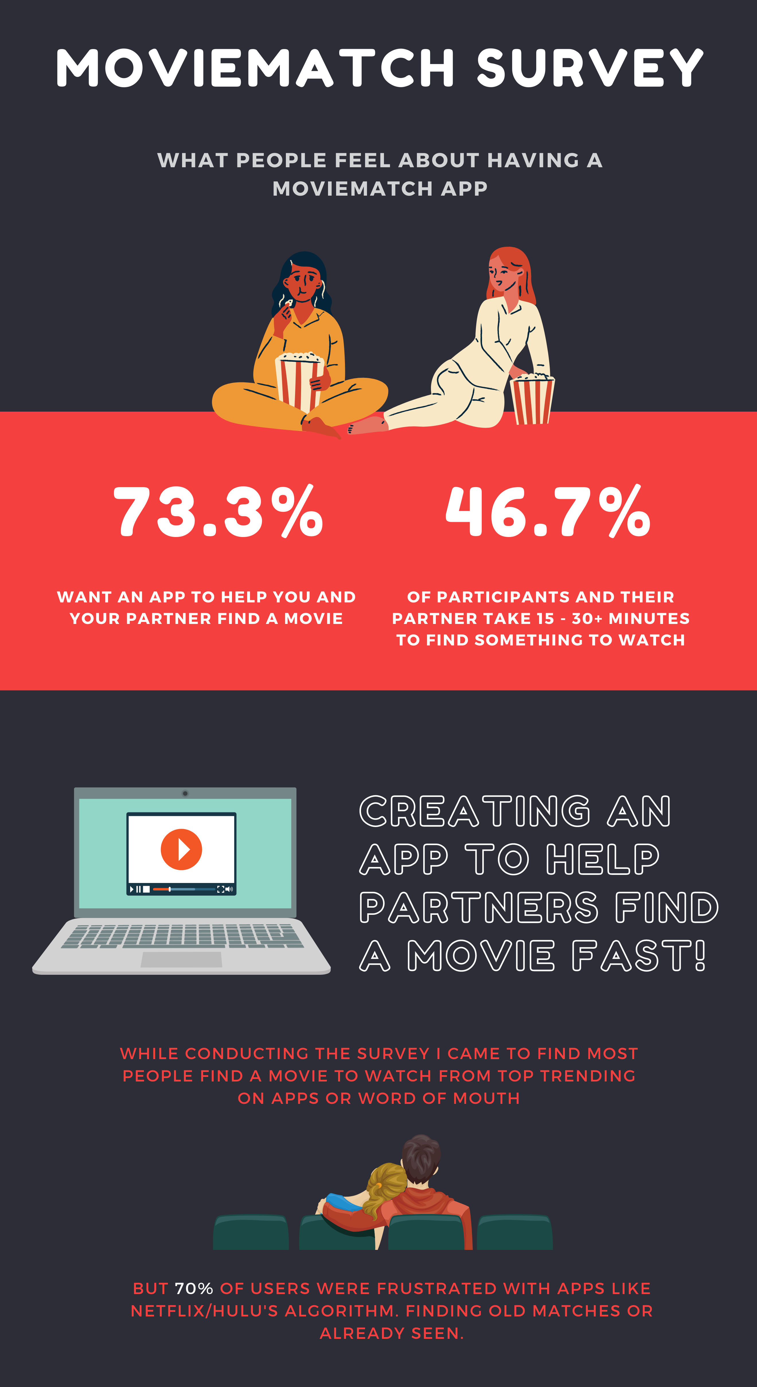
survey
After taking a look at the offerings in the space, I created a survey to better understand the needs and desires of customers. This survey was sent to 15 participants. I made sure to ask broad questions about watching preferences, but also to ask more detailed questions about features that users could want.
One big challenges with a survey like this is being able to pitch the idea of the app to the participants so that they can understand the context, without making the survey take so long that they don’t complete it.
I achieved this by starting broad and making the question more specific. The app itself was not pitched to the participants until about halfway through the survey. This gave the user context while also waiting until they were invested in the survey to make the pitch. This worked quite well.
interviews
While the survey results proved to be very helpful, I knew that conducting more in-depth interviews would prove helpful. I particularly wanted to also ask questions about dating apps that had not been asked in the survey.
These interviews gave me some very valuable information and allowed me to dig down into very specific questions about the UI. It also provided some context about survey questions that were more evenly split.
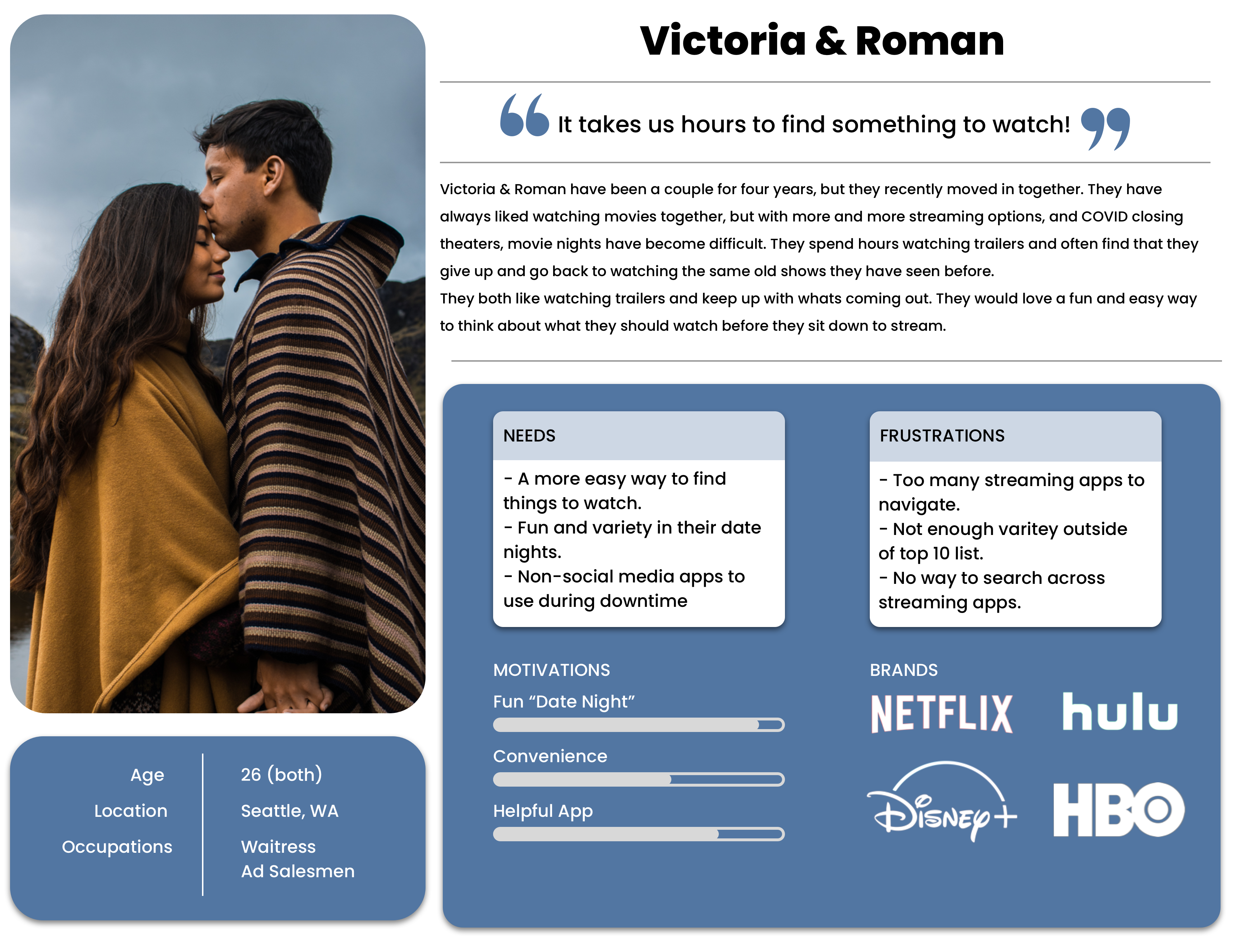
user persona
I decided to create a persona for a couple rather than to create one for individuals. Because the app is specifically geared to couples, I wanted to have a couple in mind while I thought through the functionality of the app.
information architecture
In this phase, I utilized the research materials to design the overall flow and layout of the application. I knew that for the initial process of designing a new app, it was important to create the main functionality without adding too many features. This will allow for an MVP approach to the initial concept and then iterative design in the future.
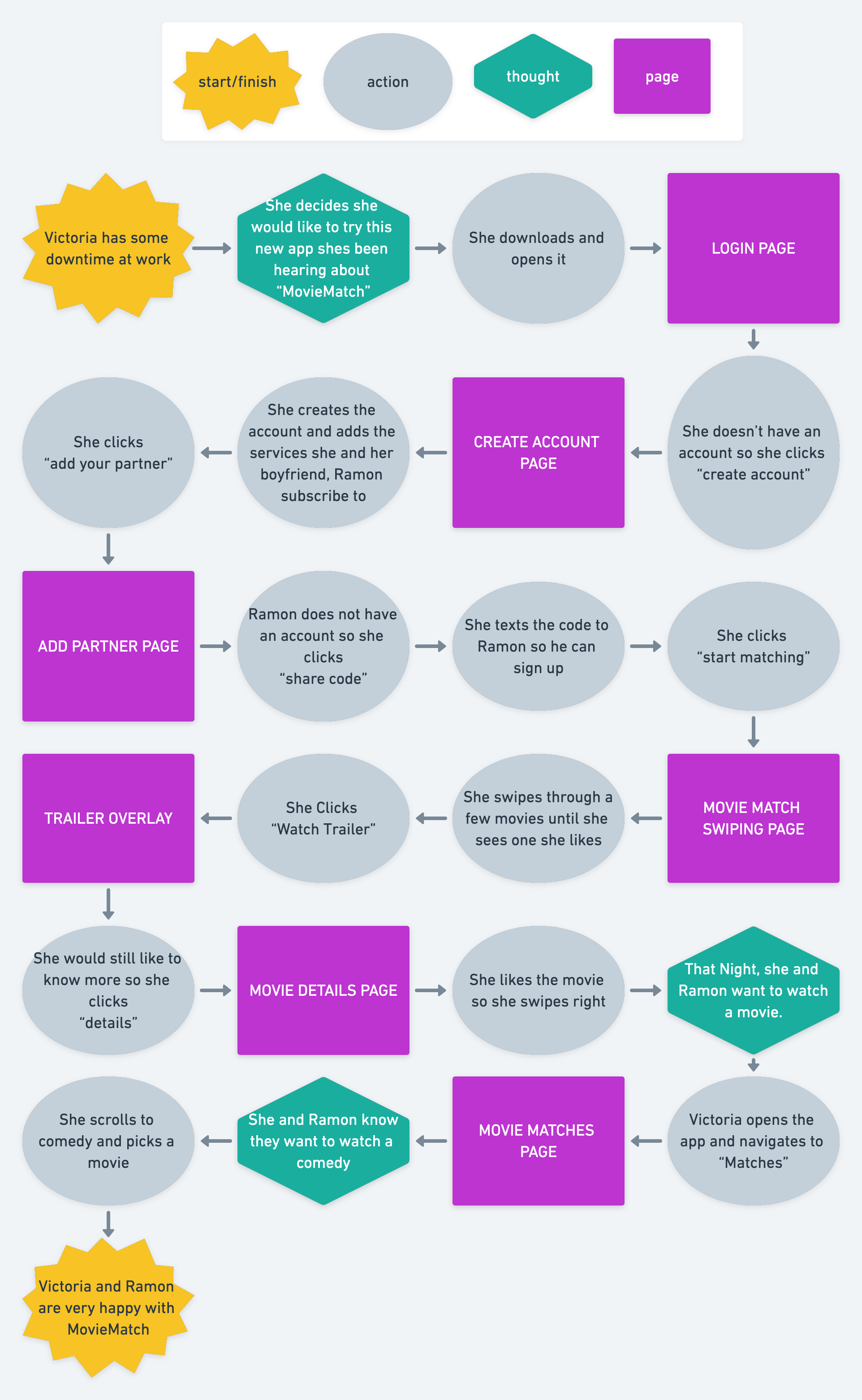
taskflow
I created a task flow to determine the pages that will be needed for the app. I kept the couple from my persona in mind and worked to create a task flow that would incorporate the process for each of them.
design
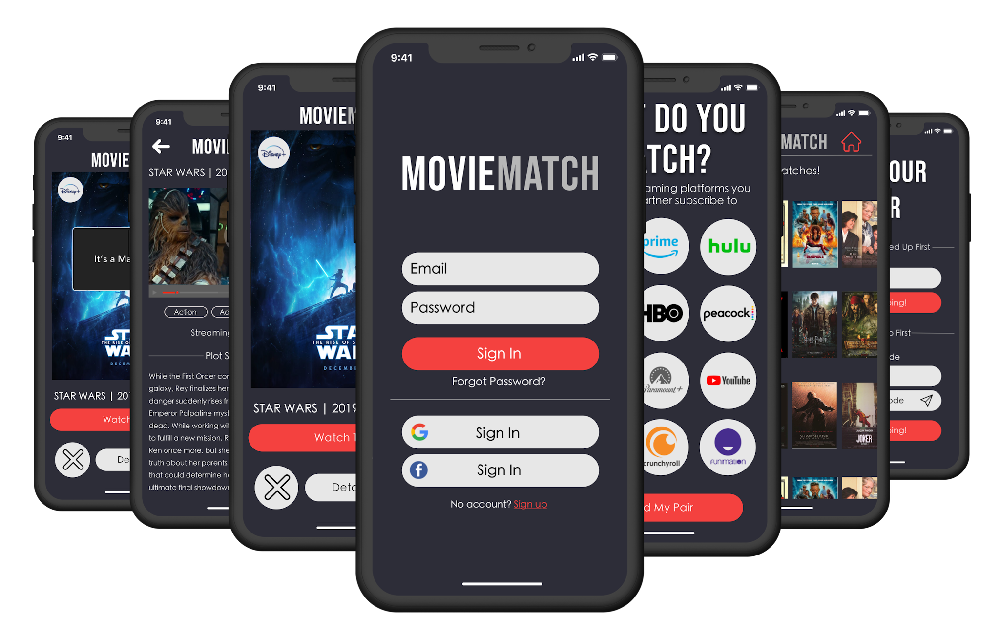
With the overall architecture established, it was time to move into the implementation of the design. I knew that it was important to find a balance between presenting this somewhat novel idea to the user while making it feel intuitive and requiring little instruction.
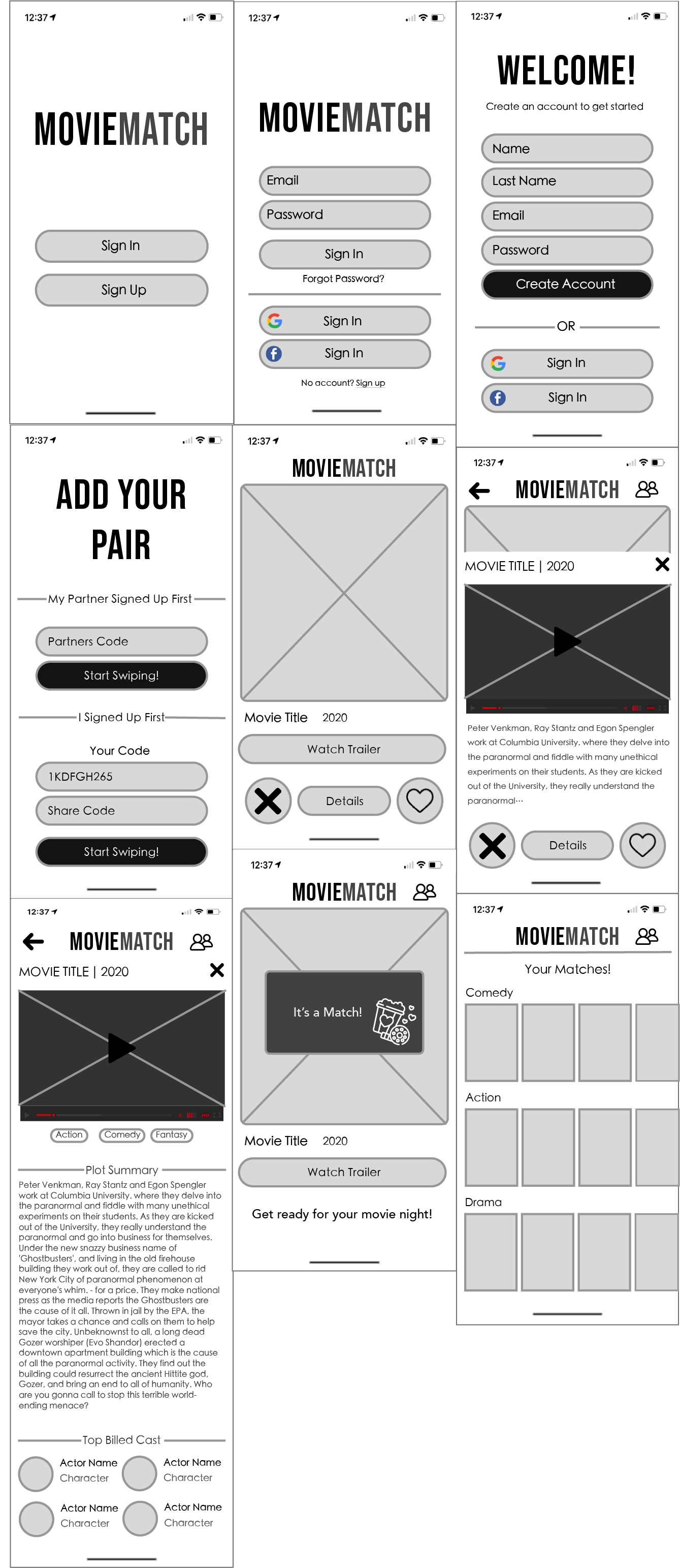
wireframes
Through the wireframing process, I worked to create a seamless flow. I chose to stick with the most successful elements of swipe-based dating apps while iterating on some of the ways the details are presented to users.
Because the signup process involves signing up with your partner, I knew it was important to make that as seamless as possible. I chose to keep the matching on one page and to allow the user to begin the process of swiping without adding their match.
I also knew that the matched page was important to focus on because this is where users would ultimately make their decision on what to watch. While my initial thought was to make this page complicated and rich with features, I quickly determined from looking through the research that it would be best to present the matches in the most simple way possible.
visual design
Finally, these designs were fleshed out with the full design for the product. I created an overall identity for this new brand in this phase. I focused on creating something that will feel exciting and pleasing to the user so they will come back to the app time and time again.
moodboard
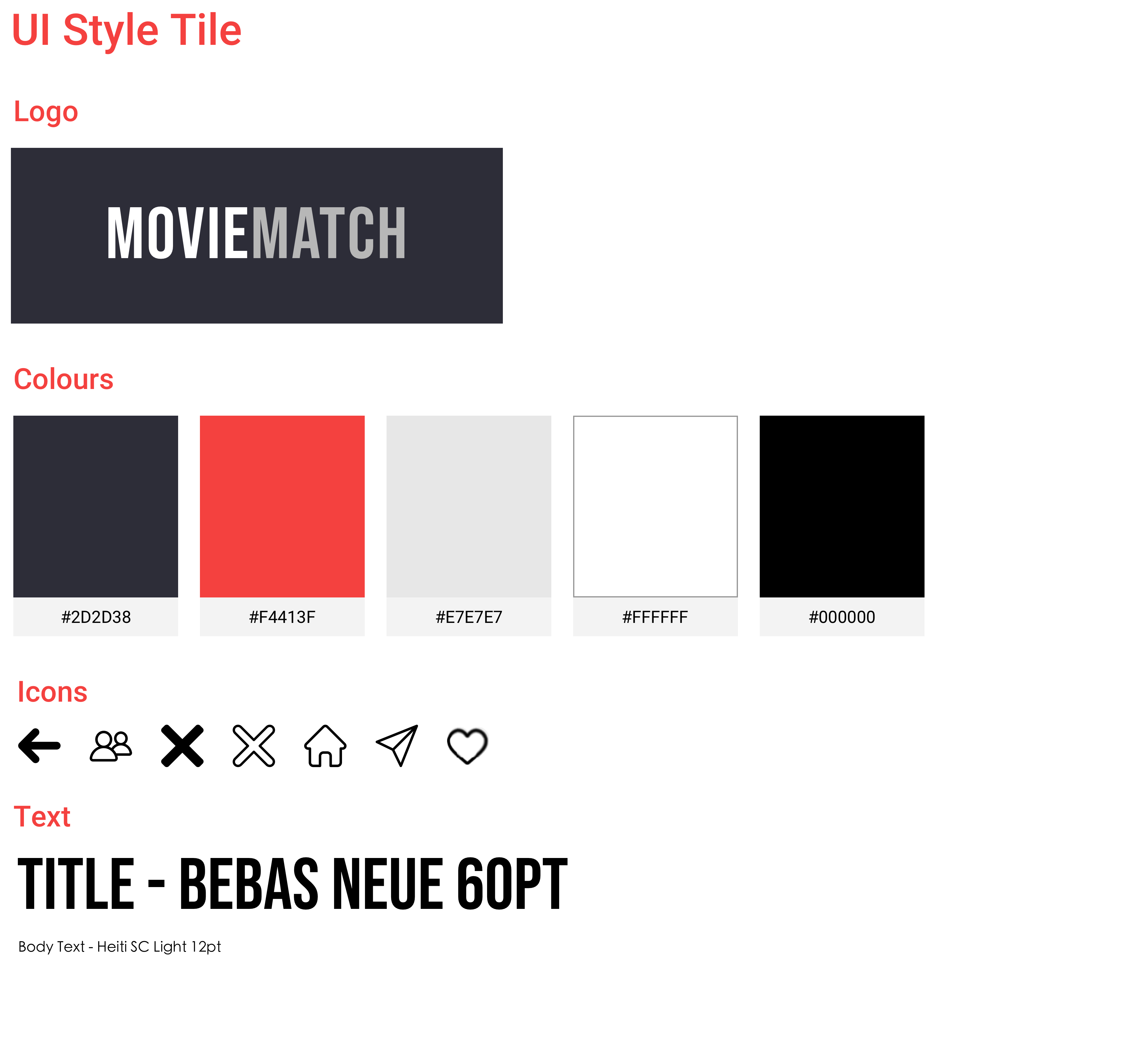
I created a mood board to capture the overall feel and direction for the design of the app. I tried a few different approaches during this phase but ultimately I landed on this iteration of the design. I knew that I would go dark and bring in a pop of red. The red evokes movies to me and it is also a color of “passion” so I felt that works well for the couples aspect of this app.
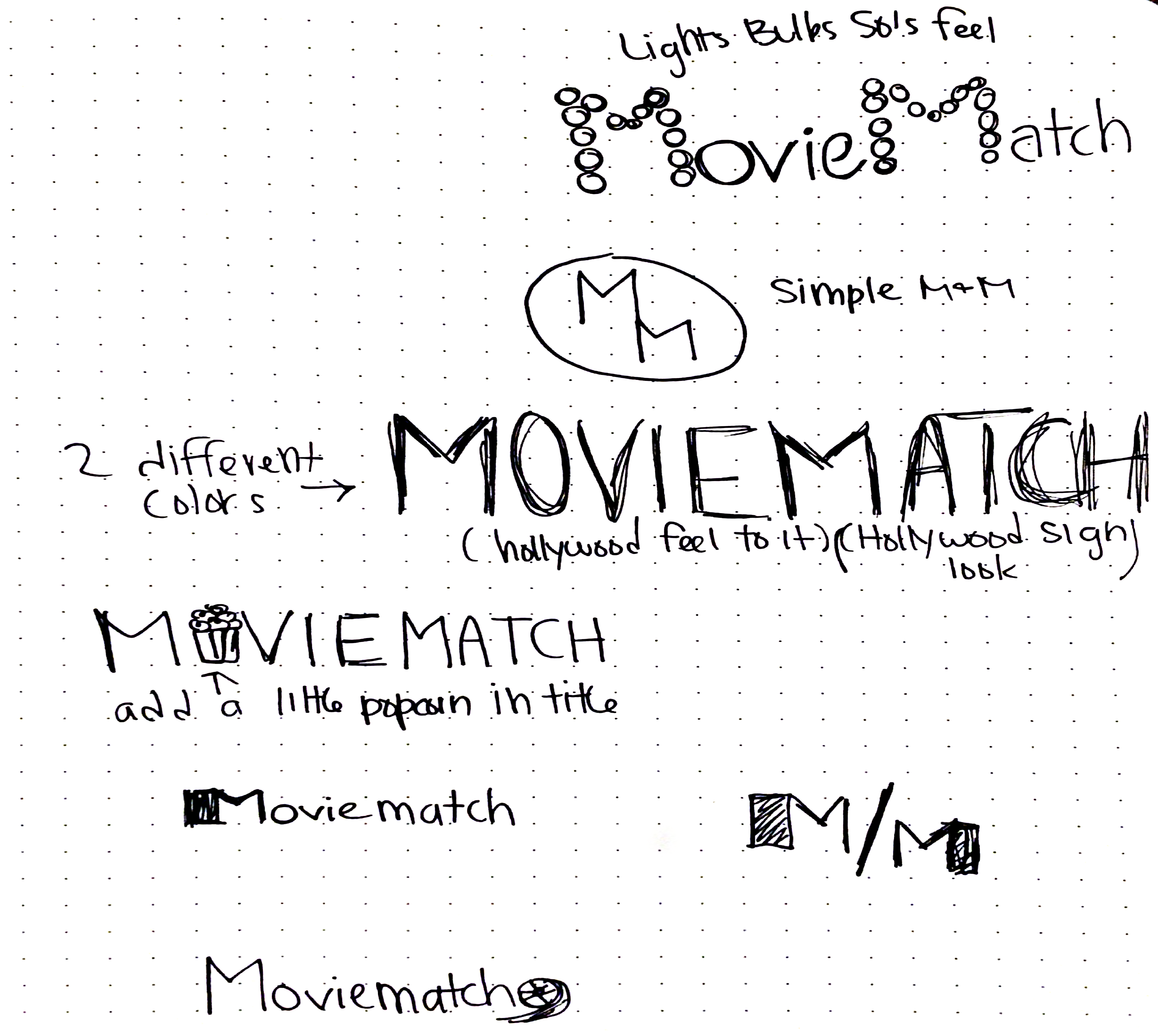
logo
After completing the wireframes, I knew that a wordmark logo was probably best for this brand. It was simple and worked well with the design. It also allowed the clever name to take the focus instead of the logo. I did decide to ideate on some logo ideas in case something came up that would cause me to change my mind. I also wanted some options for a single mark logo for the app icon.
Ultimately I decided to just stick with the wordmark for the scope of this project. I do think incorporating popcorn into the logo could be useful in the future.
design
For the final design, I went with a dark theme with a pop of red. I felt that the red added excitement while the dark theme worked well with movies and made the app feel rather sleek overall.
USABILITY TESTING
Test Objectives
- Test overall functionality of prototype
- Test efficiency of CTA's
- Test to see if user understands flow of app
Test Subject
- High fidelity prototype of MovieMatch
Methodology
- In person testing with audio recording
Participants
- 3-6 participants
- Male & Female
- Ages 22-50
Recruiting Plan
- All participants are family, friends, and co-workers
- All users have used a similar app Tinder and/or Netflix/Hulu.
Overall Impressions
- All participants liked chosen colors.
- All participants found app to be clean and clear
- Participants liked you were able to see matches.
- All participants said they would use an app like this!.
FINAL THOUGHTS
OUTCOME
The goal of this initial phase was to create a fully fleshed-out minimum viable product version of the MovieMatch app. This goal was achieved. I managed to determine the needs of this app as well as a wishlist of features. I managed to synthesize these ideas down to their most important components and utilize user research to implement a design that is ultimately very successful in both its design and function.
NEXT STEPS
This is definitely a very simple implementation of the idea. There are many features that could be added to max out this idea and take this app to the next level. Adding a “choose for me” feature on the match page could prove valuable and fits with the app goal of making decisions for you and taking the trouble out of finding something to watch. I also think it could be helpful in the long run to add a survey to the signup phase to recommend movies to swipe more effectively.
Key Takeaways
Designing from idea, all the way to the final product presented interesting challenges. Because the app is somewhat novel and not similar to other apps on the market, the research phase had to be carefully crafted to educate the participants while also getting their valuable input. Care also had to be taken to understand the user interface of popular dating apps and iterate on those design patterns to create the app, while also understanding the movie recommendation space. This two-pronged approach was ultimately successful and taught me a lot about approaching innovative design by looking to products in other categories for inspiration.


