


OVERVIEW
ROLE
- Sole UX researcher & UX/UI desinger
- Plan a new app feature and implement design
- Maintain DoorDash’s brand identity while creatinga new and fun feel for the added feature
- Usable from mobile devices
- Met weekly with a mentor to go over work
- Duration: 6 weeks
BACKGROUND
DoorDash is the largest player in the restaurant delivery space. In the way that Uber has become synonymous with ridesharing, DoorDash has become the number one brand for delivery. While the company and its valuation have thrived, they have also encountered many of the controversies associated with being an industry disruptor
CHALLENGE
DoorDash has garnered a negative reputation in the way that they skim from restaurant’s bottom lines in their current monetization strategy. They also face stiff competition from smaller players in the industry and need to continue to innovate inorder to maintain their position. While COVID-19 has highlighted the companies ability to help small businesses, they need to do everything possible to keep a positive relationship with these small companies.
SOLUTION
Add a feature that is similar in nature to Hello Fresh and other meal subscription boxes that utilizes the large network of local restaurants under DoorDash’s purview. The goal being to provide a source of recurring revenue for restaurants while also creating an exciting new experience that customers will enjoy.
PROCESS
RESEARCH
The goal of this phase was to gather information to better understand what consumers expect from a subscription box experience. As well as to understand ways in which the user experience for a subscription box app could be improved upon.
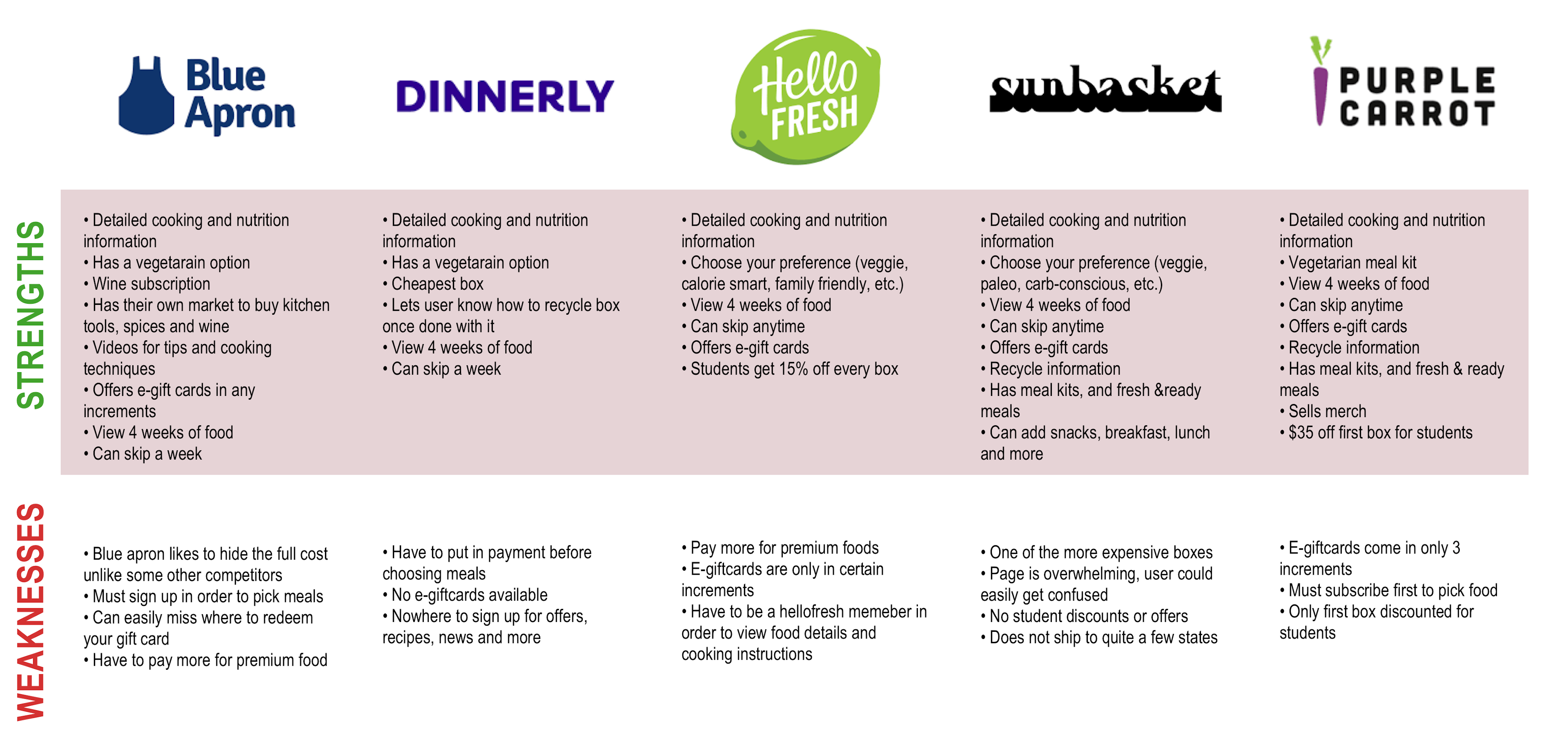
Competitive analysis
The first step of the research phase was to take an indepth look at the large players in the meal subscription box space. To understand their offerings as well as the various ways that their respective apps guide users through the process of selecting meals.
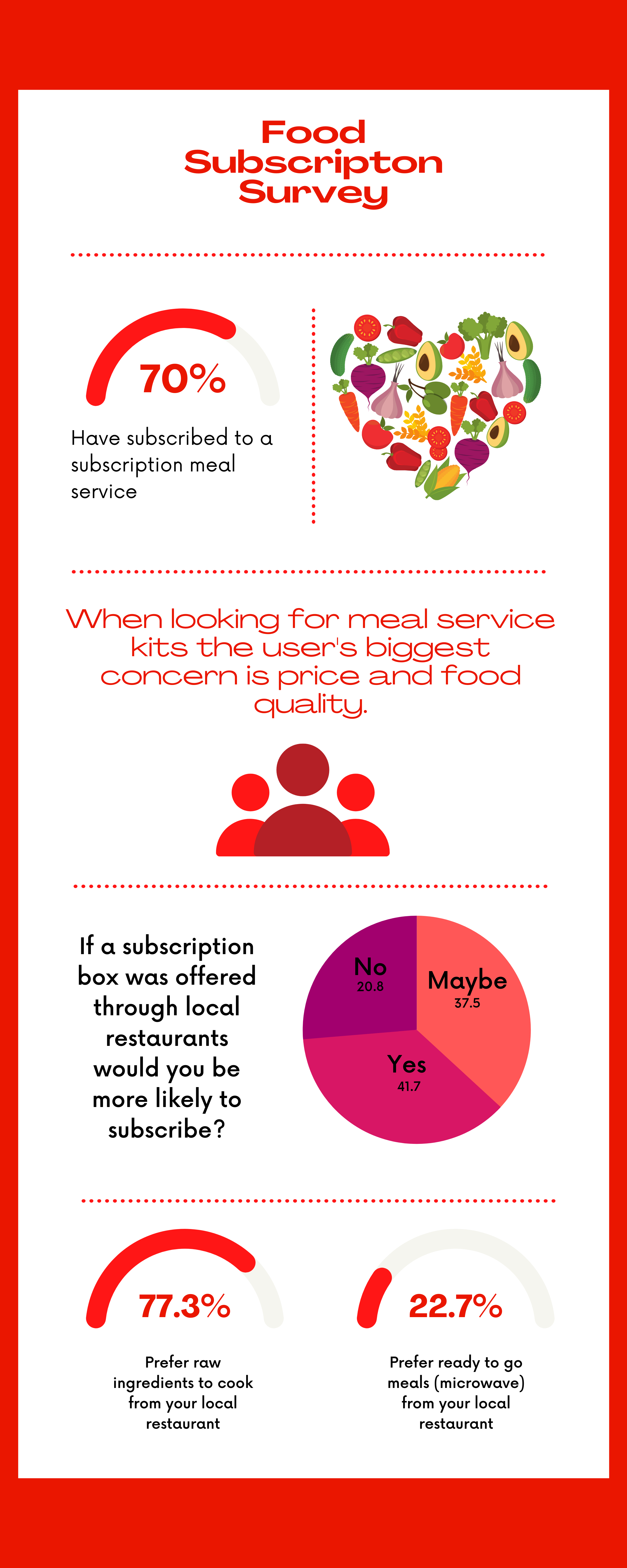
Survey
After exploring the market, a survey was created to get an idea of what consumer trends existed and to determine what users have come to expect as well as what is left to be desired. I utilized google forms to survey 20 people.
Interviews
After conducting the survey I found that many of those polled had not used a subscription service, but that the desire to cook food at home from a local restaurant definitely existed. I decided to conduct a more in depth interview with two of the individuals from the survey. One was an avid user of Hello Fresh, while the other had canceled after a short period of time because they became frustrated. I felt that both of these people could provide deep insights on ways that the current players in the space are succeeding and failing in their UI implementations.
These interviews proved to be some of the most valuable information gathered during the research phase. It proved that raw data alone cannot always provide the full picture. My desire to dig deeper and search for both a micro and macro view of the user paid off.
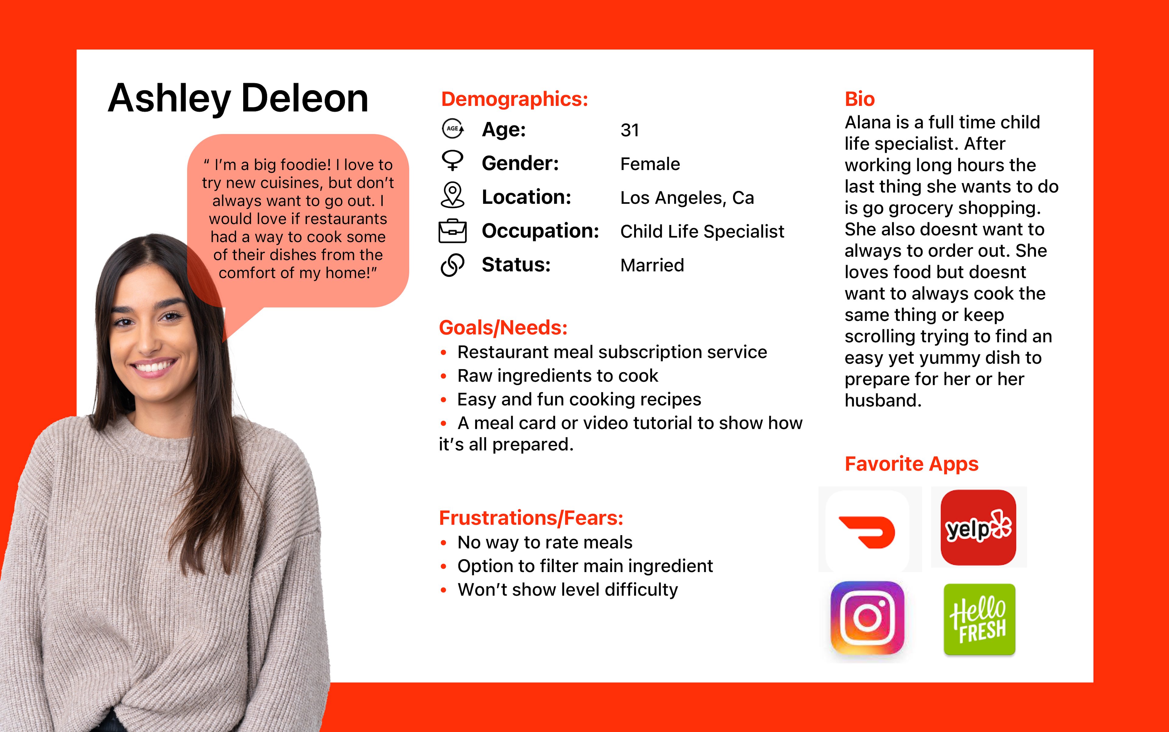
User Persona
Finally, I created a user persona to have a person in mind as I moved to the design phase. I have found that it is always valuable to get in the headspace of this imaginary user and to always consider the information they desire and the most efficient way to provide it to them.
information architecture
In this phase, I utilized the research materials to design the overall flow and layout of the application. The goal was to create a full and rich experience with this new feature while making it blend seamlessly into the DoorDash architecture and not cause the app to feel bloated with this large feature addition.
taskflow
I quickly determined that a user flow was unnecessary for this case. I instead opted to create a user task flow. This flow would follow the user through the process of discovering the new feature, choosing to subscribe, and then creating their first box to be delivered. This document provided a clear path for the user to follow and also was how I determined what pages would be needed as I moved into the design process.
design
Now that the overall architecture had been established, I moved on to crafting a design for this new feature. I knew that it was important to provide a clear way to navigate to this new section of the app, while keeping the features completely separate from the main DoorDash infrastructure to prevent bloat.
wireframes
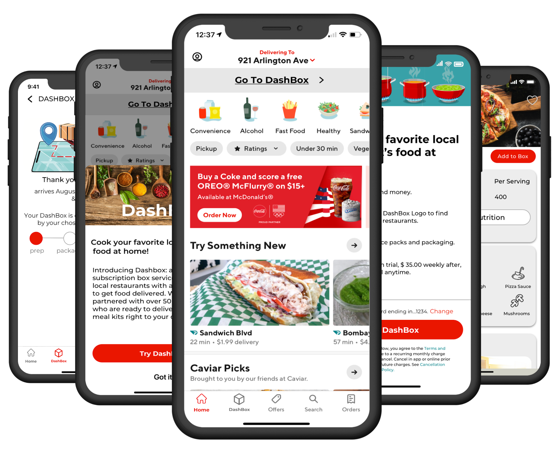
Through the wireframing process, I leaned on the successful design patterns from the large players in the subscription box space, while also utilizing the user interviews to add features that would alleviate frustrations and set the DoorDash “dashbox” experience apart as a superior offering.
I implemented a simple and non intrusive way to navigate to Dashbox. Within the Dashbox experience, I added several features that users in the interview phase expressed a desire for.
I added a favorites button so that they could easily return to meals that they loved. I also added a difficulty meter and a health score right to the “browse meals” page so that users could get the information they most desired, without having to click away from the page.
I also made an edit to the bottom navigation bar and made careful decisions about when it should and shouldn’t be present. This allows users to have the option to navigate back to the main DoorDash app if they choose to at various key points in the process.
visual design
Finally, these wire frames were fleshed out with a design to maintain the DoorDash aesthetic while still creating a fun look and feel for this new feature. I utilized DoorDash’s iconic red, but I also added in a blue that will distinguish this new section of the app and provide its own subtle identity.
USABILITY TESTING
Test Objectives
- Test overall functionality of prototype
- Test efficiency of CTA's
- Test to see if user can complete doordash task
Test Subject
- High fidelity prototype of DashBox
Methodology
- In person testing with audio recording
Participants
- 3-6 participants
- Male & Female
- Ages 22-50
Recruiting Plan
- All participants are family, friends, and co-workers
- All users have used the app DoorDash and/or meal subscription services.
Overall Impressions
- All participants found DoorBox to be clean and clear.
- All participants felt like added feature was related to DoorDash
- Participants liked you were able to “heart” an item.
- All participants were able to find and identify things quickly.
FINAL THOUGHTS
OUTCOME
The goal of creating a unique feature add to DoorDash that would keep the company innovative while also helping to improve the company's image with regards to helping, not hurting, the growth of small businesses was definitely achieved. The final result maintains the DoorDash brand and also innovates upon industry trends in the subscription box market to create an offering that sets DoorDash apart. The final result is easy to navigate. I managed to create a very full featured addition without adding a clunkiness to the overall app.
Key Takeaways
I found it to be very valuable to explore the constraints of working within the bounds of an already established brand. I feel that I was able to maintain a consistency with the DoorDash design patterns while still creating a distinct feel for this new feature. I found that the research phase was vital and that digging deeper to interview selected participants from the broader survey allowed me to make key decisions that pushed the UX to the next level.
This project proved to me that I have the ability to iterate and improve upon the already impressive UX/UI design implemented by large companies.


